Interior Designer, Sheila Bridges’ Dog-Themed Decor
Interior design legend talks dog-inspired decor.
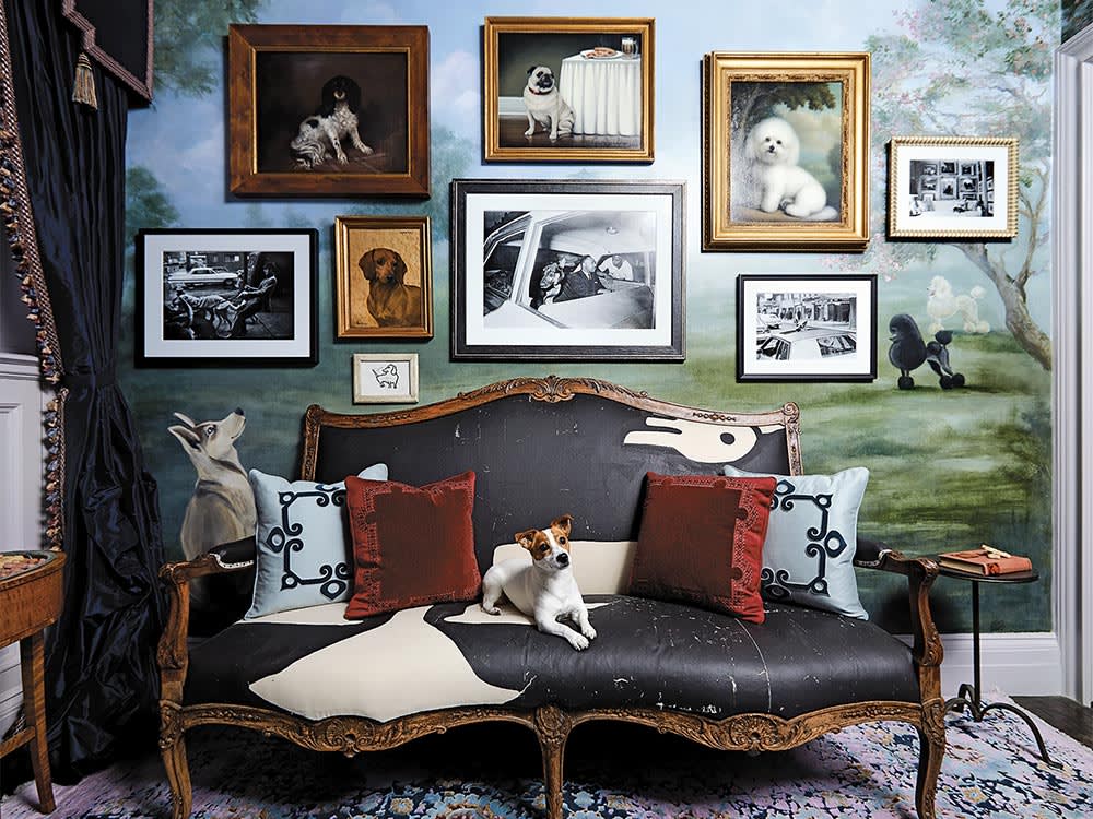
Sheila Bridgesopens in new tab, one of America’s most esteemed interior designers, created Salon des Chiens, for the prestigious Kips Bay Decorator Show House in New York City, a fundraising event for the Kips Bay Boys and Girls Club, which serves more than 10,000 young people throughout the Bronx. The top interior designers selected to participate had 30 days to transform a randomly assigned room as they saw fit. Bridges’ was a celebration of dogs.
Her work has been showcased in exhibits and museums nationally and internationally and was named “America’s Best Interior Designer” by CNN and Time Magazine. Bridges was given a small ground-floor reception room that looked out onto the street to design. Adding to the challenge was that the house’s public bathroom could only be accessed by passing through this room. By the end of the month, however, Bridges was ready to unveil her Salon des Chiens, a place for canine care and enjoyment. Why, we wondered, had she chosen that theme? So we asked her.
What inspired this design motif?
The room had a lot of limitations, so I had to come up with something a little more creative. The house is a block and a half from Central Park, and I would see dog walkers and people with their dogs pass by. I had two Australian Shepherds, Jax and Wheeler. We had this routine of going to Central Park in the mornings, and that was part of my inspiration in terms of the colors and some of the design, including the mural of Central Park as the backdrop to the Great Hill, the area in the park where we walk.
Tell us about the dogs in your life.
My first adult dog — the dog you get as a grown person — was Dolby, a Jack Russell Terrier; he was 14 when he passed away. He was a wonderful dog and went everywhere with me…to work, and traveling. He was full of personality, and it was very difficult when I lost him in 2008. I waited about a year before getting another dog. Instead of getting the same breed (I did not want to get another Jack Russell, as I’d always be comparing), I decided to get an Australian Shepherd, and ended up getting two. I tried to make the whole experience very different. Jax and Wheeler, very distinct personalities from my first dog, but both superspecial. Wheeler, who recently passed, was a working dog who helped with the horses and sheep on my farm. I miss him dearly. All the dogs have been important members of my family; I can’t imagine life without them. I wanted to be a veterinarian way before I decided to become a designer!
How much do you spend on your pet per year?
Tell us about the graphics you included and why you selected them.
I layered on all of these dog portraits — a mix of formal portraiture and black-and-white photography, as well as needlepoint and drawings. I used quite a few archival images from the New York Times and also incorporated some Civil Rights–era images.
I wanted people to think about their relationship with dogs, which is sometimes informed by culture and history — where you come from and what your background is. Some of the pieces I included in the space were quite provocative; if nothing else, they created an opportunity to have a conversation. And that’s what happened; there would be a line of people waiting to use the powder room (it was just a sink and a toilet). As people stood there, they would look more closely at the images.
I had this great one from the New York Times of a gentleman who was considered New York City’s first professional dog walker; it’s from 1964 and was taken right outside of Central Park. I just love it — he was so well dressed, the opposite of every dog walker I know now (my dog walkers wear shorts and t-shirts). He had on a sports coat, trousers, nice leather shoes and a hat. He was so stylish.
In the middle of the room, I hung a photograph of Martin Luther King sitting in the back of a car with a German Shepherd. I ended up having some interesting conversations about that image. A lot of people commented, “Oh, look, how wonderful … I’ve never seen this picture of Martin Luther King and his dog!” Most African Americans saw immediately that it was a police car, and recognized Andrew Young, who was standing outside the window talking to him.
The photographer has been identified as Bob Moreland, but I don’t believe anybody knows the true story behind the image, although some say that the dog was put in the back of the police car to intimidate him on his way to jail, while others think the dog was put in the back to protect him. So, how you interpret the image depends on your vantage point. It was great for conversation, which is why I chose to display it.
Were you surprised by any of the reactions?
The room was fun to do. People love to talk about the drapery, the mural, the carpet — that’s why people come to those design show houses. But what was astounding was that, more than talking about design, people wanted to talk about their dogs.
You designed a little surprise for those using the powder room.
I had a “beware of dog” sign on the door, and when someone stepped into the powder room, a motion detector activated a recording of a barking dog (one of those security devices to scare off intruders). So visitors saw this pretty bathroom with dog portraiture everywhere, but as soon as they stepped over the threshold, the sound of a barking dog was activated, and it wouldn’t stop until they left the room. Ninety percent of the people thought it was hilarious, but a few were flustered.
There were a number of reasons why I did it, but the main one was practical. Neither I nor the people waiting in line needed to hear others going to the bathroom, and they, in turn, didn’t want to be heard. The other thing is that the dog barking encouraged people to get in and get out. I had a number of people come into my room and say, “I have to go to the bathroom — I don’t need to use it, but I’ve been told I have to go to the bathroom!” The barking dog helped make it a whole experience.
